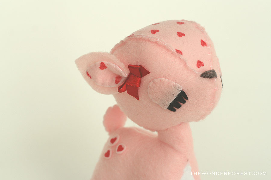
While I was doing some of my new product shots this morning, I thought to myself, “hey, self, why don’t you share this process with your readers?”. So here I am, sharing my photo taking process with you all!
This is probably going to be the easiest tutorial ever, but I promise it makes all the difference in the appearance of your shop, if you are a handmade seller, for example.
All you need is a sheet of bristol board in your selected colour. You can pick up a sheet at any office store, craft store, or in my case, dollar store. They come in tons of colours, so pick one that will be easy to use consistently and match the overall feel of your store. I can’t stress this enough — all of your photos should be consistent. If that means re-doing your product shots multiple times to get them all right, then so be it (believe me, I’ve redone all of my Wonder Forest photos about five times until I was happy with a “look”) . It can only improve your listings.
Anyways, on with it! Grab that bristol board and a chair. You can also do this on a floor near a wall but I like the mobility of a chair. You’ll want to place that chair somewhere in your home/office/space that has the most natural light. I always choose to go near a large window, depending on the time of day it will either be at the front of my house or the back of my house. I rarely ever take photos in the evening/night because the light just is not there. You’d be surprised if you saw the difference between a photo taken in the same spot at night compared to the day time.
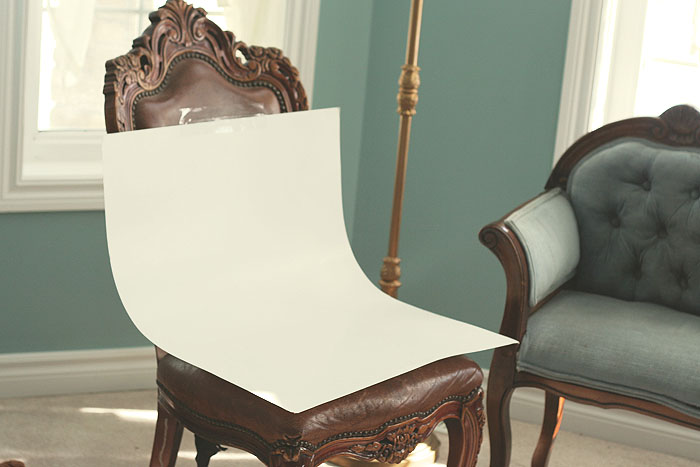
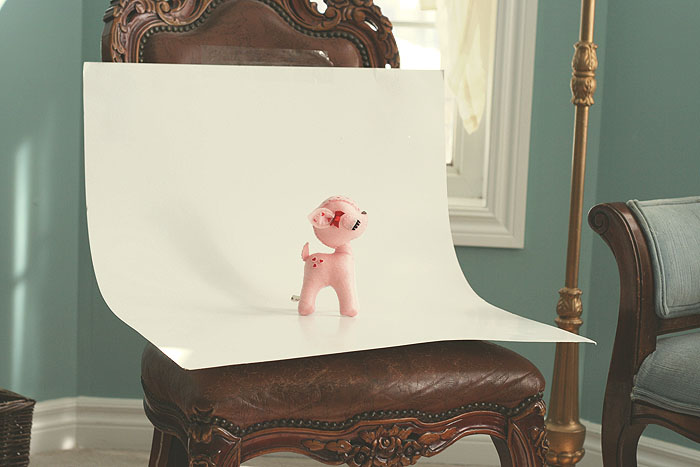
Place that bristol board on your chair like so. If using a wall, just tape it to the wall instead. I prefer taking photos using one bent sheet as opposed to two (one on the bottom, one on the chair back/wall) because it makes for a seamless backdrop. I hate seeing that line in photos where the floor meets the wall. Maybe I’m a little OCD about my photos? 😉
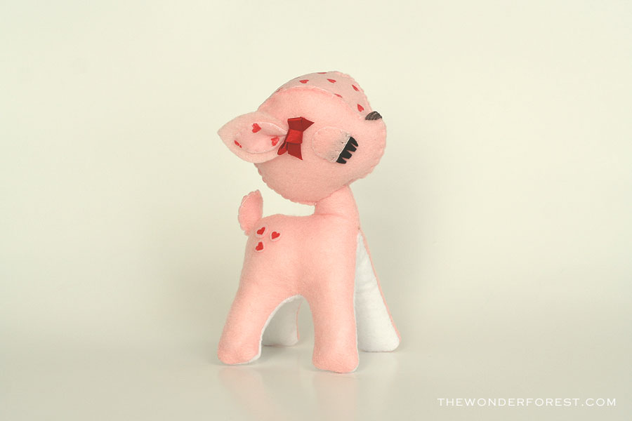
Place your product on the backdrop and start shooting. Be sure that the surrounding background is not visible in your photos, obviously. If it is, you can easily crop it out in Photoshop. A fancy camera helps, but it really isn’t necessary. If you have the right light and setup, your photos should turn out just fine regardless of your camera.
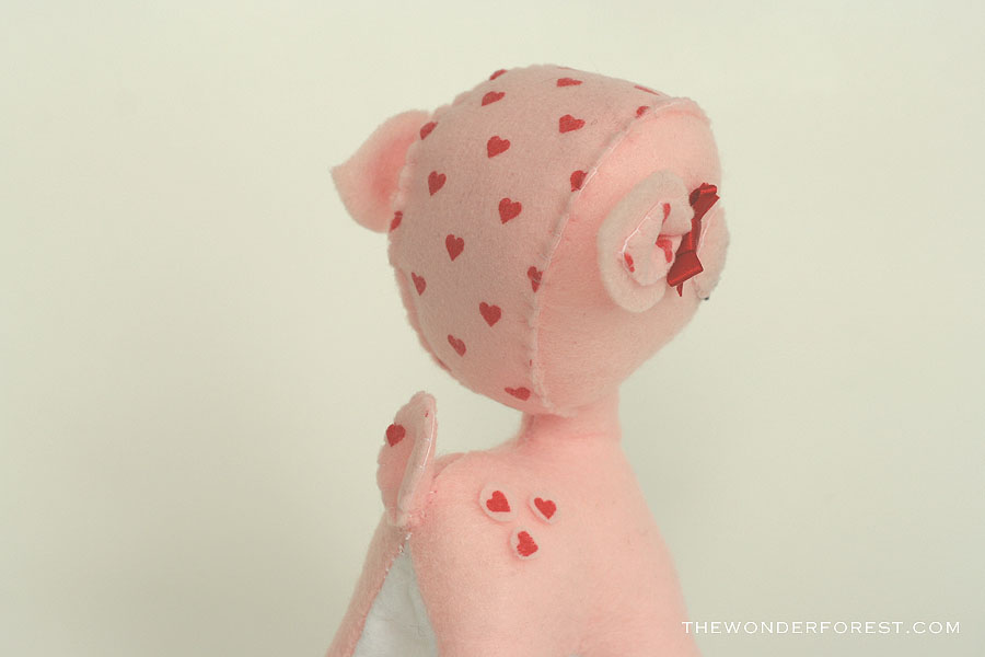
It’s important to take various angles of your product, so the viewer gets a real feel for every aspect of it. I normally do 5 shots of my plush, from side views, to close-ups of detail, to back views.
After I have my shots, I transfer them to my computer and do a little resizing in Photoshop. (Image > Image Size > 900 pixels in width). I usually do anywhere from 700-900 pixels wide because it makes for a nice viewing size. Not too small, not too big. Too small, and you risk deferring the customer if they can’t see product details. Too big, and you hurt load times and distort your images if the viewer clicks to enlarge the image, resulting in it being resized by their browser or being too “zoomed in” if they expand it.
I also like to add my little ‘thewonderforest.com’ tag to all of my product shots. This helps if people were to Pin my stuff or lose the source.
So, there you have it! I hope I helped you in your future product photo taking ventures!
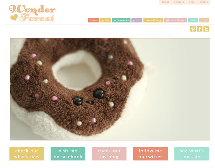
By the way, I redid my Wonder Forest shop design! It is much more clean and simplified now. I did this so that my photos would stand out more, and the visitor’s experience would be more streamlined. Why not go check it out and let me know what you think? The above deer will be listed soon!
Last Updated on

