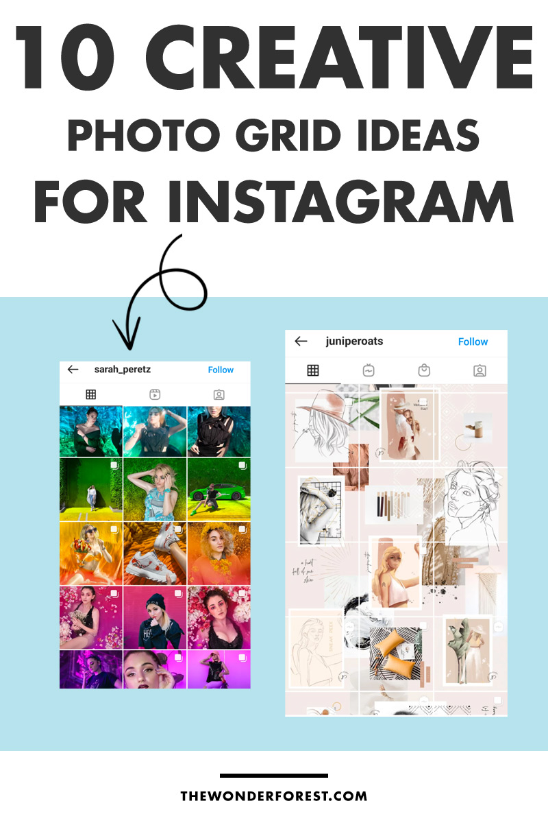
Are you ready to level up your social feed with some awesome Instagram grid ideas?
A curated Instagram feed instantly sends your audience a clear message and lets them know what they can expect from you. It is a way of visually telling your brand’s story and convincing your audience to join you on the journey.
There are many different types of photo grids you can utilize – let’s take a look.
Back to the Basics
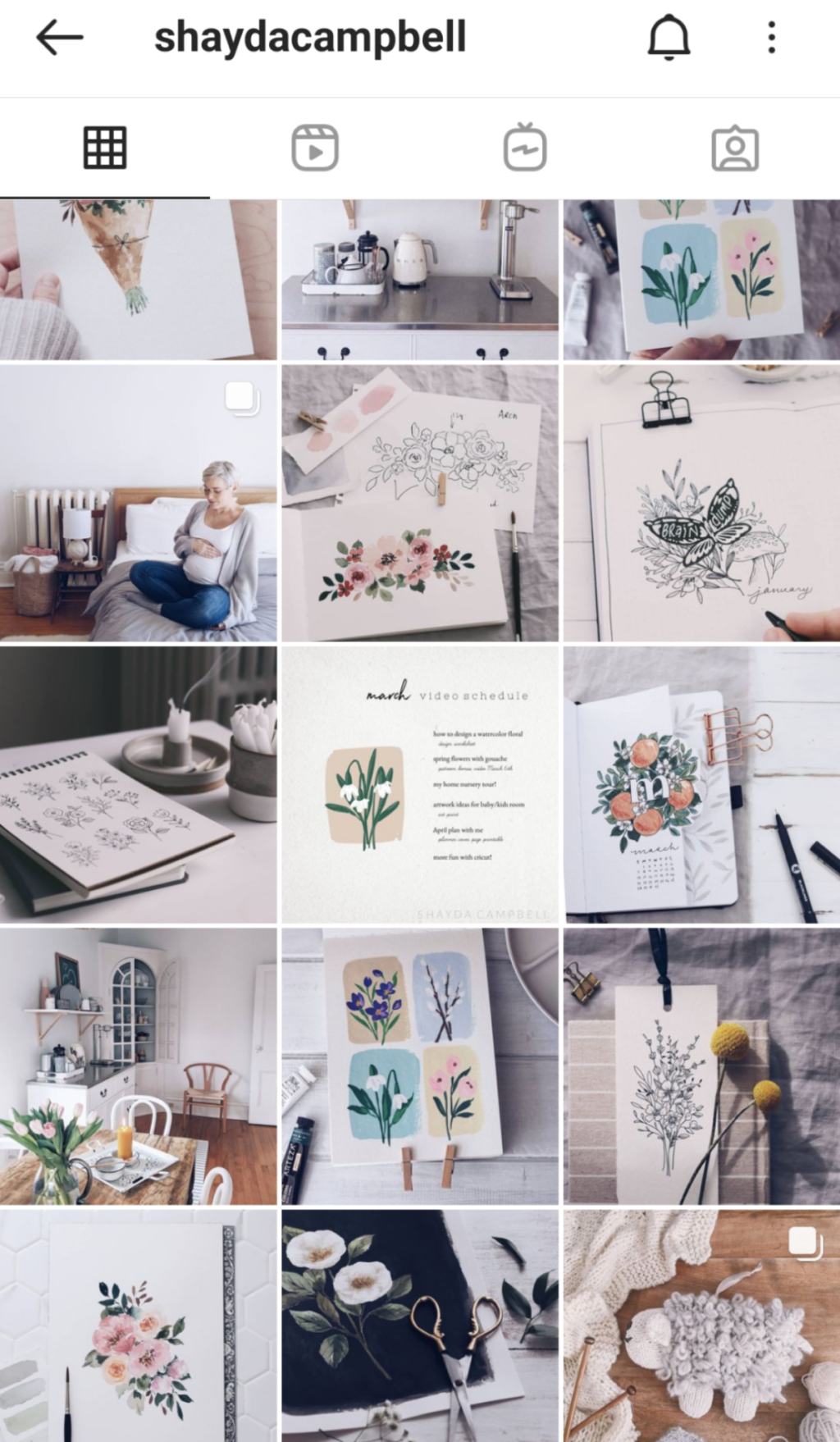
Keep it simple! Don’t overthink your feed if you are going with basic squares; just upload one post at a time, and make sure there is a consistent filter or theme applied to your images to keep it looking cohesive. Here’s how to edit your photos for a white, dreamy feel.
Horizontal Story
This layout is an excellent form of visual storytelling. The trick is to post three consecutive images with the same colour, content or theme. As we tend to read left to right, top to bottom, your feed will read like a magazine, with each row telling its own story.
Vertical Lines
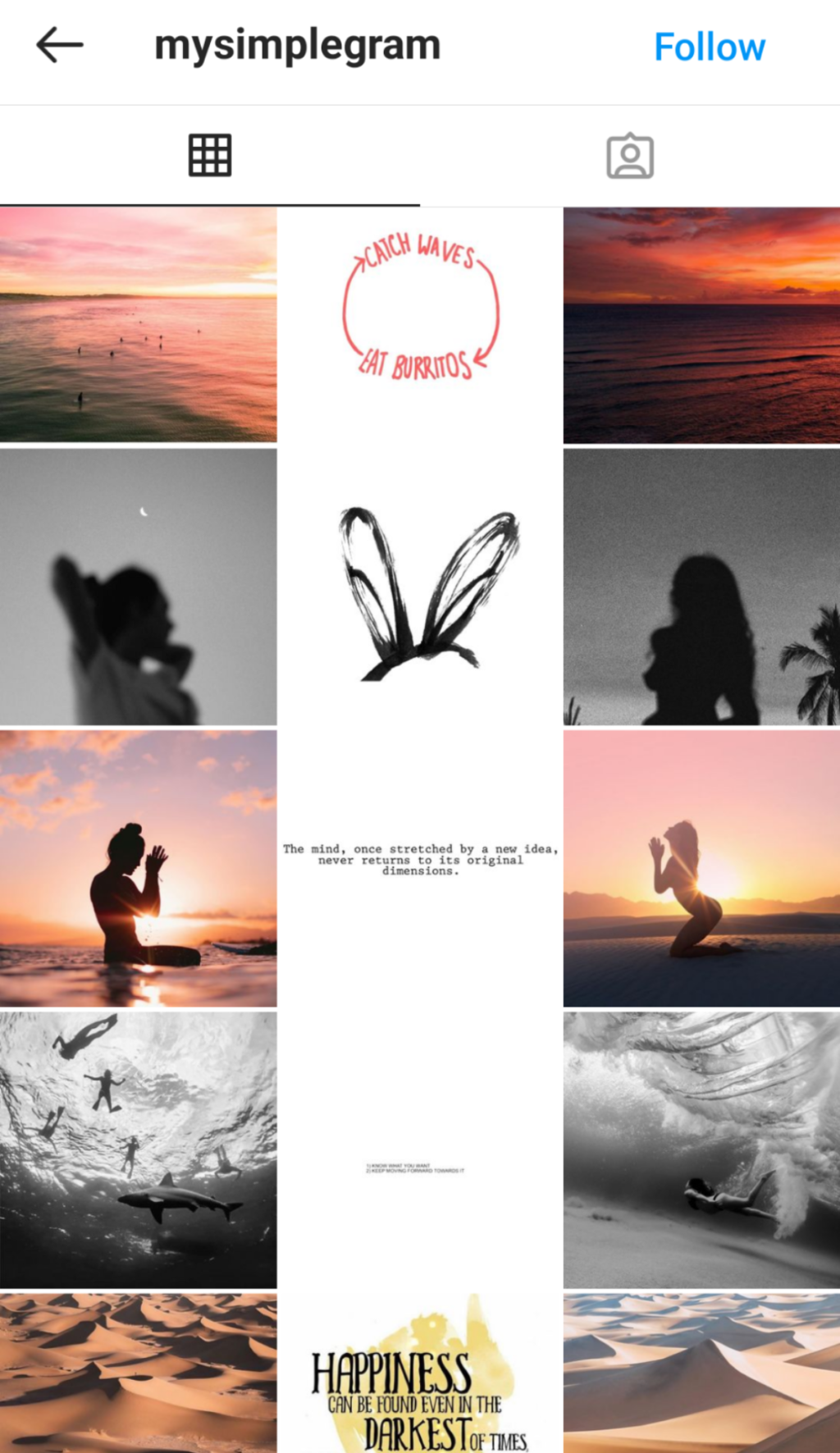
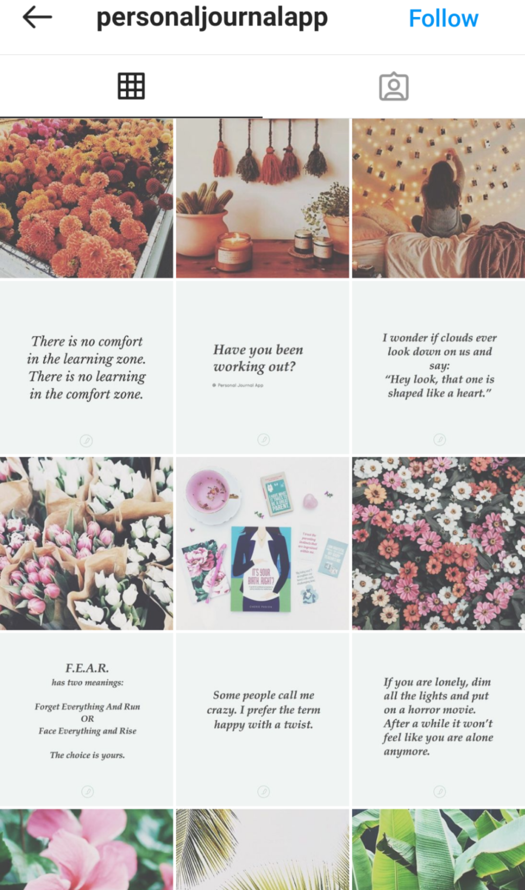
One of the most popular Instagram photo grids is the vertical line theme, which consists of keeping one of your columns (often the middle one) a consistent colour or image. A popular choice is to post text on a solid background colour, as you can see below. This helps break up your feed and keep a consistent theme without having to overplan.
Checkerboard
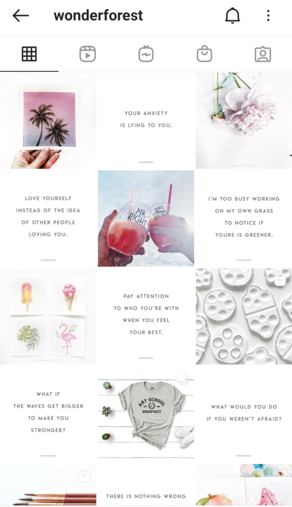
The checkerboard theme consists of images that alternate between colours or content. For instance, you might post a quote, followed by a photo, followed by another quote. Or you might post a dark picture, followed by a bright one, followed again by a dark one.
Rainbow Grid
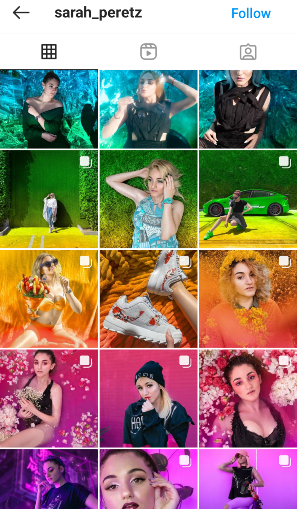
The rainbow grid requires a lot of planning, but boy, does it look pretty! The idea is to transition each row, or group of rows, from one colour of the rainbow to another. You might upload 3,6, or 9 red themed photos, before moving to the next colour of the rainbow. The result is a colourful but consistent feed!
Borders
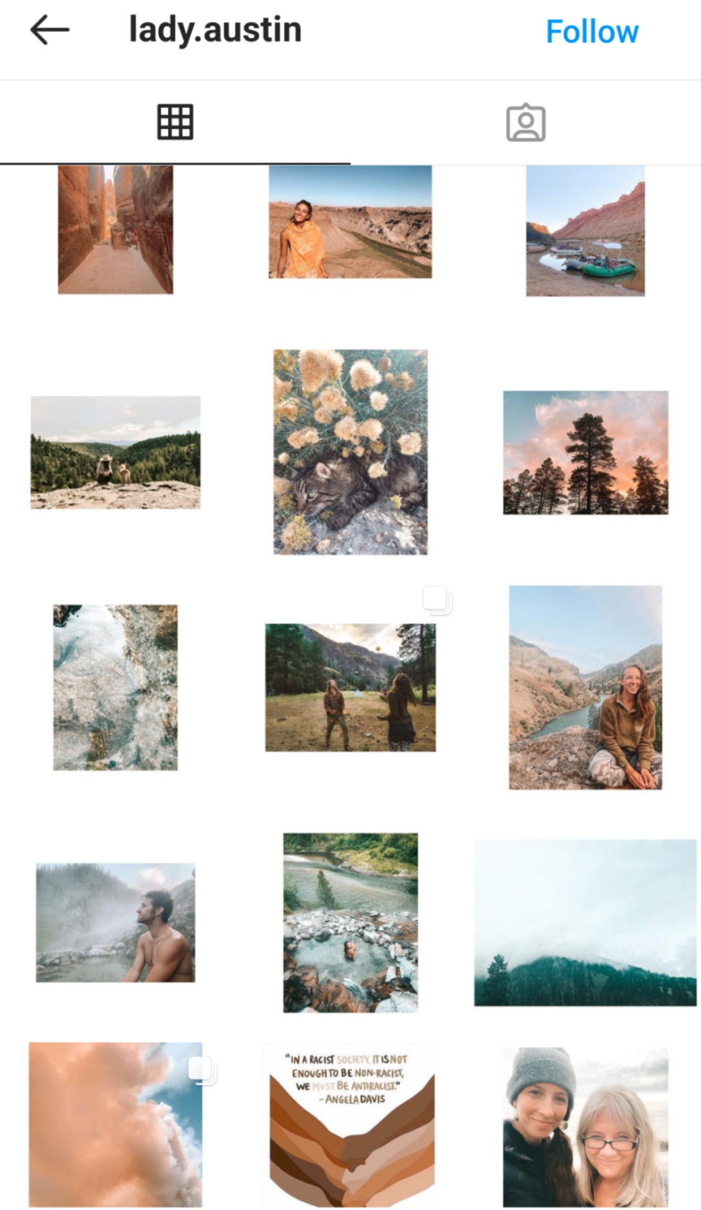
Adding a border to your images is a great way to create negative space on your feed and allow your pictures to breath. The most common border choice is white, but don’t feel like you must follow the status quo. Using bright or block colours will help you stand out – you could even incorporate the rainbow theme we spoke about above.
Colour Blocking
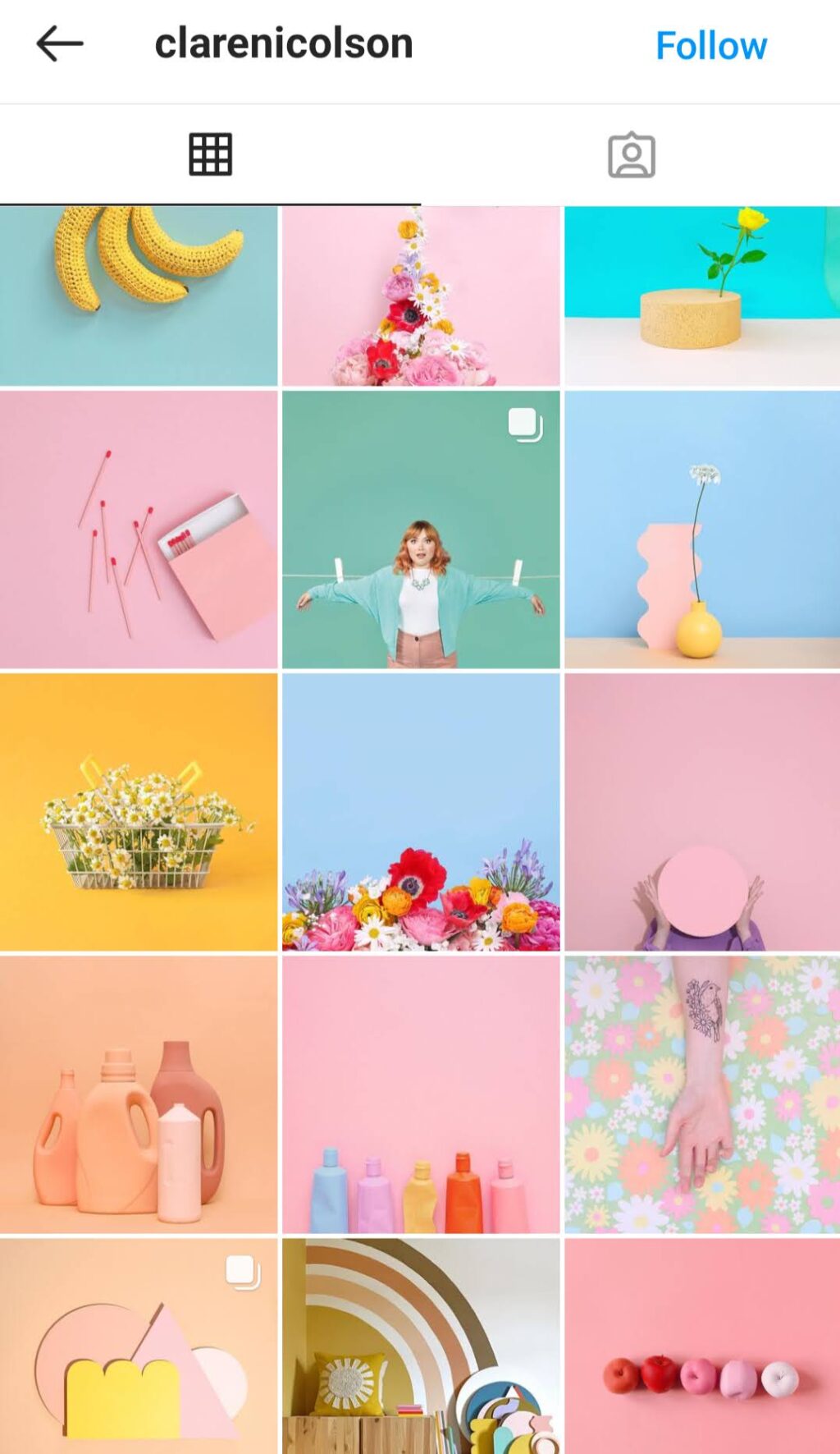
With a bit of planning, an Instagram feed that utilizes a colour blocking grid will pop! Make sure your images use a similar saturation for consistencies sake, and then upload either 1,3,6 or even 9 posts that focus on the same block of colour.
Diagonal Stories
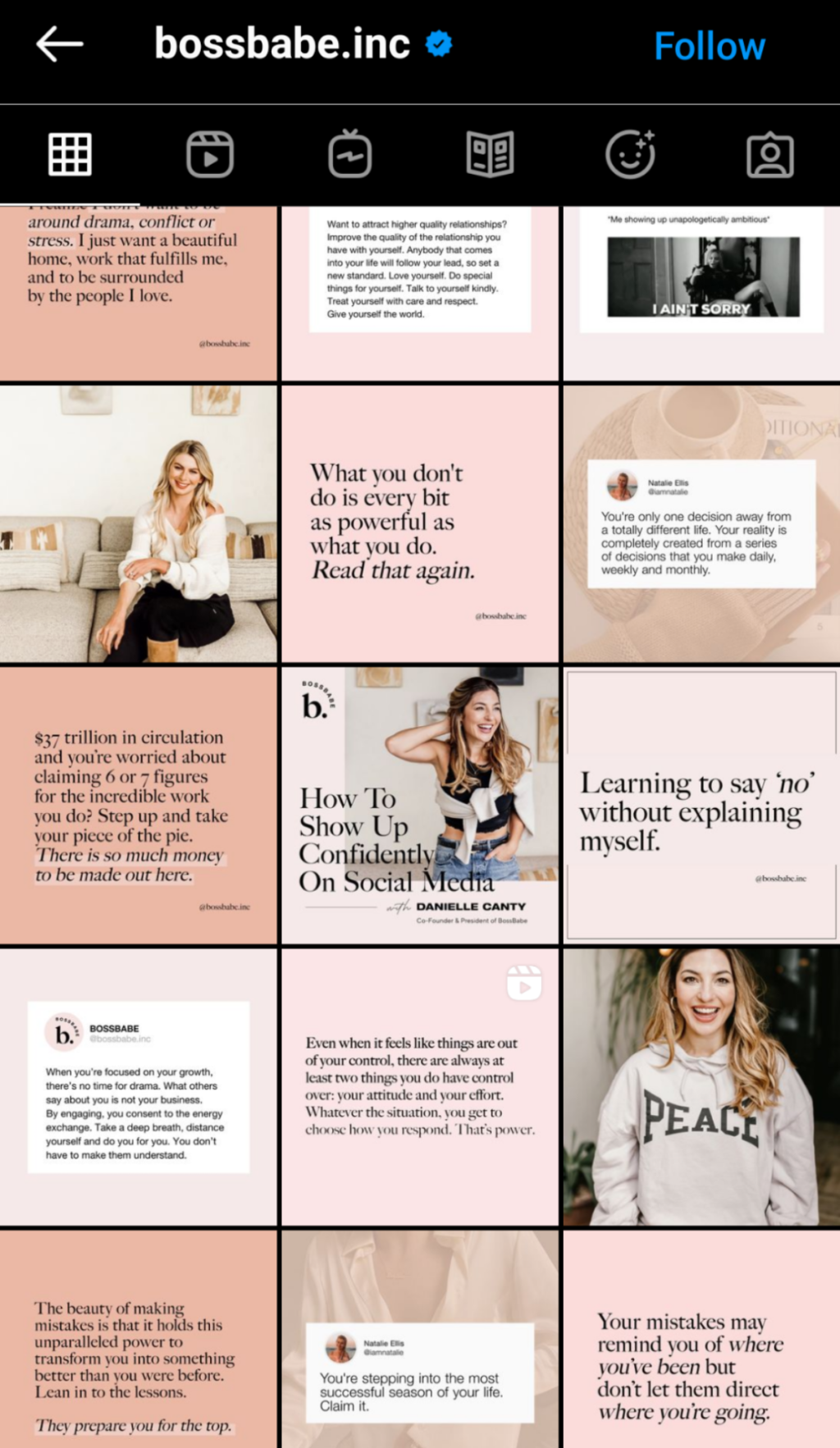
A diagonal Instagram feed consists of similar images that appear from left to right, diagonally up or down. This grid is an excellent option as it embraces consistency but still offers variation when scrolling through a profile.
Puzzle Grid
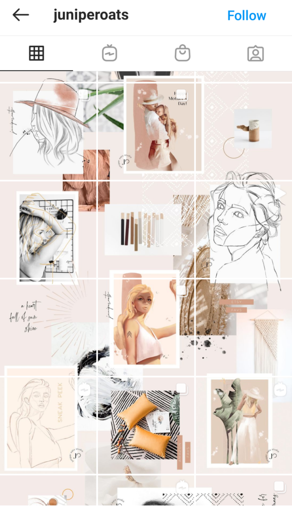
Possibly one of the trickiest themes to pull off, but one of the most visually pleasing is the puzzle grid. This theme involves each image being connected to the ones around it. You may want to look into image splitters or Instagram planners if you’re going to attempt this one! You want each photo to ideally be able to stand on its own as well as be part of the larger puzzle.
Mixed Grid
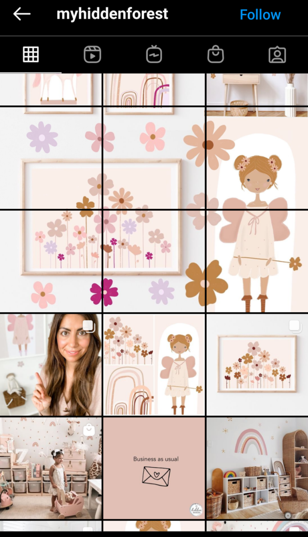
Do you get bored quickly? Crave some variety in your life? You don’t have to stick to the one grid forever! Mix it up over time. Choose one theme for, say, 9 posts, and then move onto something new to create an exciting and varied Instagram feed.
PIN THIS:
Last Updated on

