
Today’s blog post is a bit of a tricky one. I was unsure about posting Photoshop how-to’s because I know that a lot of you might not have Photoshop, or use other versions like Photoshop Elements… which I don’t ever use. I suppose, however, that if you DO have Photoshop or are planning on getting it, this would be a great start for you.
Firstly, I only use Photoshop CS3. Yes, it’s a little older, however the newer versions don’t seem to mesh well with my computer. I have yet to figure out why, but CS3 has always been my trusty sidekick.
Today I’ll take you through the creation of a simple sidebar banner, that other visitors can copy and paste into their own sidebars. Much like my own over there on the lower right.
The most common sidebar size I find is about 150-200px wide. So, it’s best to make a banner with this in mind. We’ll make one that is 180×180.
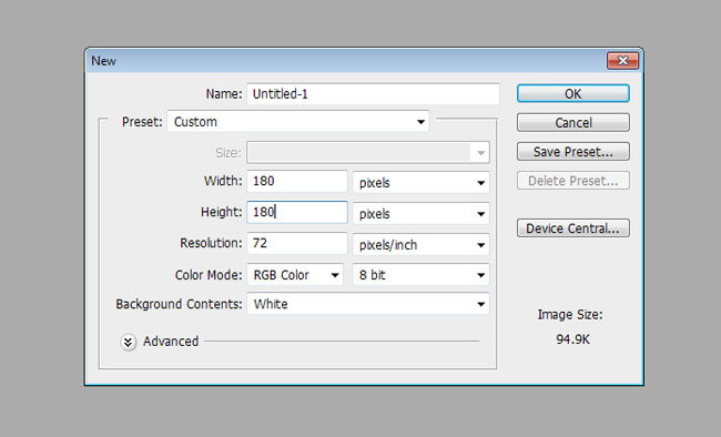
Open up Photoshop and go to File > New to create a new document.
Enter the dimensions of your new button in the dialog box that appears. Make sure the dropdown is set to pixels, and the width and height are both 180. Also, very important for graphics that are going to be used on the web… Resolution needs to be 72 and the Color Mode should be RGB. These are usually set by default, but just double check before creating your document.
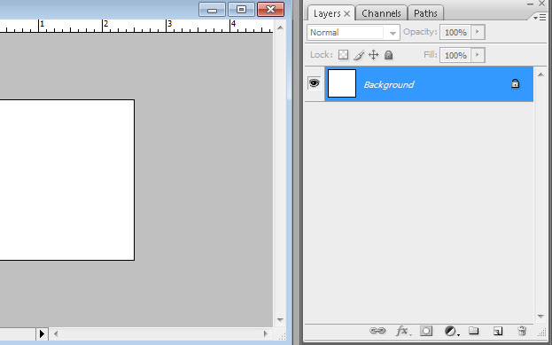
Now we have a blank white square to work with. On the right hand side of your screen, you should see a Layers palette as shown below:
If you don’t see a Layers palette on your screen, you can enable it simply by going to Window in the top navigation menu, then choosing Layers so there is a checkmark beside it. Your layers palette is one of the most important things when it comes to Photoshop.
Our background is locked as the main base layer. Let’s change the background colour of our background to a pink shade.
First, you’ll choose the Paint Bucket tool from the toolbar. It might also look like a Gradient tool. In that case, hold your mouse button down on it for a second and you’ll be able to change it to the Paint Bucket tool. The toolbar buttons have multiple options, so learning that you can hold your mouse button down on them to swap them around is key.
After you’ve selected the Paint Bucket tool, you’ll need to choose your colour. Simply do this by clicking on the colour swatch at the bottom of the toolbar. Photoshop allows you to store two colours here, and you can swap them by clicking on the little arrows directly above the boxes. Clicking on the black box in our example will bring up the Color Picker dialog. Choose your colour and click OK.
Now with your Paint Bucket tool still selected, all you need to do is click on your white background to fill it with the colour. Simple.
Now we want to add some text to our banner. Fonts are SUPER important. The wrong font can seriously either mess up or make the best of your image. You can download a whole bunch of different fonts online. My favourite place to get fonts is dafont.com. Your computer comes loaded with a bunch of standard ones as well (some better than others) so it’s not totally necessary to get custom fonts, but it really does help.
To type, simply select the Type tool from the toolbar. Click back on your pink background and start typing! You can see that your Layers panel just added a new layer for the text. To stop editing the text, you can either click the FAR “enter” button (on the numbers keypad of your keyboard) or click the Move tool (arrow icon at the top of your toolbar).
To change the font and edit the type options, check out the Character palette. If this isn’t visible on your screen, just choose Window at the top > Character. Here, we can edit the font face, change the font size (48pt in my example), change the Color (white), and the line height (36pt. “Auto” is standard but playing with these numbers will increase or decrease the spacing between your lines). Here you can bold your text and italicize it as well. The Paragraph tab at the top of this panel will allow you to set your text to be aligned left, right, centered, etc.
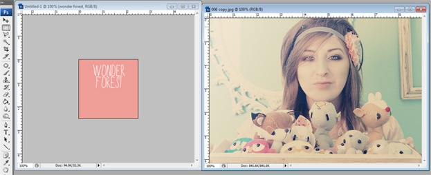
Alright so now what if we want to add an image to this banner? Easy! Go to File > Open and find an existing photo on your computer to open.
The quickest way to get this image into the banner document is to simply grab it and drag it over. You could also do a select all/copy/paste but I like the drag method better.
Select the Move tool which is at the top of the toolbar, and then click and hold the mouse on your photo and drag it into the pink banner box.
The image is obviously too large for this box, so let’s resize it. Click the Rectangular Marquee Tool which is directly below the Move tool you just selected, and right-click on your banner. Choose Free Transform. This will make a bounding box appear around your image with dragable corners.
Here’s a tip for you: To make sure you resize the image in its correct proportions, hold the SHIFT key while grabbing one of the four corners and shrink that image!
I’m not very happy with the placement of my text, so let’s move it! Click on the text layer on your Layers palette to select it. Whichever layer you select in your Layers panel is the one that you will be working on. So, to move my text down, I select my text layer, and grab the trusty Move arrow tool once again to move the text to the bottom. I also decided to make my text on a single line and decreased the size slightly. To do that, just select the Type Tool again and click on your text. Use the Character panel we used earlier to modify your text.
If you wanted to place the text on TOP of your photo, all you would have to do is grab the text layer in the Layers panel and drag it above the “Layer 1” photo. Think of the Layers palette as layers in a cake. The layers appear in the order they are shown in the panel, from top to bottom.
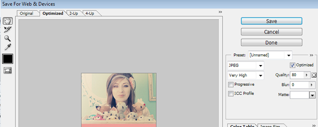
I think that’s enough for the basic Photoshop lesson today! Let’s save this image for the web! Go to File > Save for Web and Devices.
Choose your save settings. On the right, choose the JPEG option. Set the quality to “Very High” so it looks good on the web. Saving any lower than “Very High” usually compromises your image. Very High automatically sets the Quality to 80. You can save it at a higher rate than this is you like, but this should be standard. Then just click Save and name your file!
Once you have your button saved, you can upload it to a place like Photobucket, or another image hosting site. To add the button to your sidebar, you’ll need to create an HTML code that people can copy and paste to their own sites. First, add the image to your sidebar by creating a new HTML/Javascript sidebar widget and entering the code. It should look something like this:
<img src=”http://www.FULLURLOFYOURPHOTO.com/yourimageurlhere.jpg”>
Then, add the copy/paste code below it:
<textarea><a href=”http://www.YOURSITE.com” target=”_blank”><img src=”http://www.FULLURLOFYOURPHOTO.com/YOURIMAGEURLHERE.jpg” border=”0″></a></textarea>
The “textarea” bit tells the site to create a text box, and anything inside of the textarea parts will be displayed inside of the text box.
I hope this helped you learn Photoshop a little bit and make your very own banner ad! I’ll go into more detail in future posts… but there is a LOT of stuff that could be covered, so if you want to learn about something in particular, PLEASE leave a comment and let me know!!!
Last Updated on





Hi Dana ! Excellent tutorial . I can use these tips for my own photos. Thanks and keep such more tutorials 🙂
https://www.mockupsandmore.com